You export your manuscript as an EPUB, upload it to KDP, and a week later you buy your own book on Amazon to see how it looks. But something's wrong. The chapter heading sits too far down the page. The first line of dialogue isn't indented the way you formatted it. A scene break that looked perfect in your drafting software is now a weird orphan at the bottom of a Kindle screen.
This happens to nearly every indie author at least once. The confusion usually lands somewhere between "Did I format this wrong?" and "Is Amazon changing my file?" The truth is simpler and more useful: different reading platforms use different rules for how they display text. Your manuscript isn't broken. Your formatting isn't wrong. The platforms are just speaking different languages.
Reflowable Text vs. Fixed Layout
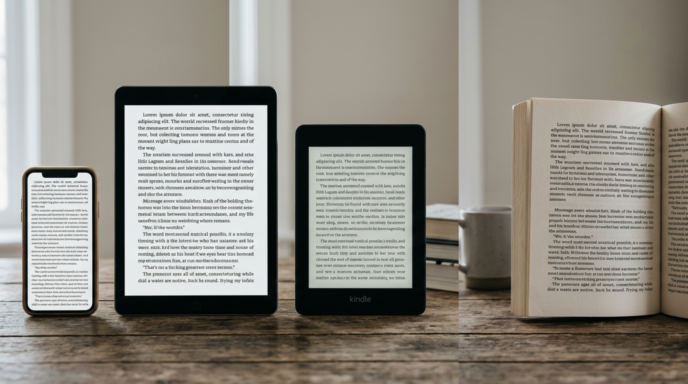
The core difference is this: ebooks (Kindle, Apple Books, Kobo, Google Play Books) use reflowable text. Print uses fixed layout.
Reflowable means the text reflows to fit the reader's device and preferences. A reader on a Kindle Paperwhite can make the font bigger. A reader on an iPhone sees fewer words per line than a reader on an iPad. The text wraps and rewraps for each combination of screen size, font choice, and margin preference. A chapter heading doesn't sit at a fixed pixel coordinate. It sits wherever it naturally lands after all the preceding text.
Print is the opposite. A page is exactly 6 inches wide and 9 inches tall (or whatever your trim size is). A chapter heading lands on a specific page number. The font size doesn't change when you hold the book at arm's length. Every reader sees the same layout, period.
This is why your ebook and print version look like different books.
What Renders Differently on Kindles
Amazon's Kindle devices and apps have their own rules about how they display EPUB and KDP print files. Here are the practical differences you'll see.
Font Size and Line Spacing
The reader controls these. You can suggest defaults in your EPUB metadata, but the Kindle user can override you. Someone reading your novel on a Kindle Paperwhite at the largest font setting will see maybe six words per line. The same person on a Kindle app on a phone might see three. Indentation, margins, and spacing all scale with the user's choices.
Your careful alignment and positioning don't travel to the Kindle. If you've set a scene break to center-align with extra space above and below, the Kindle app respects the alignment and spacing semantics, but the actual visual result depends on what font size the reader chose.
Chapter Breaks and Page Breaks
On Kindle, there's no such thing as a page break in the traditional sense. You can insert a break that tells the Kindle reader "start a new 'page' for pagination purposes," but the reader won't see a blank page or a hard page boundary the way they would in print. Chapter beginnings often appear with some extra space, but not because there's a physical page break—it's because your EPUB file signals a chapter boundary.
Images and Embedded Content
Kindles handle images differently depending on device. A grayscale e-ink Kindle Paperwhite shows images in grayscale. A Kindle Fire tablet shows them in color. A phone running the Kindle app shows them at whatever resolution your device supports. An image you sized carefully might be too small on a phone or so large it consumes the whole screen on an e-reader.
Fonts
The Kindle reader chooses from Amazon's available fonts. You can embed a custom font in your EPUB, and some Kindle devices will use it, but many will ignore it and fall back to Amazon's defaults. This is why your beautiful serif font choice might render in a sans-serif on someone's device.
What Renders Differently on Apple Books
Apple Books, iBooks, and the Apple Books app (across iPhone, iPad, and Mac) have their own rendering engine and set of quirks.
Margins and Padding
Apple Books applies its own margin rules, especially on iPad. Your carefully chosen margins might be overridden or squeezed. Indentation can shift slightly depending on device orientation.
Typography Features
Apple Books is generally more permissive about custom fonts than Kindle. It's more likely to render your embedded fonts correctly. But it's also more opinionated about line spacing and letter spacing. Some authors report that Apple Books increases line spacing on certain fonts.
Scene Breaks and Ornaments
A custom scene-break ornament (like a fleuron or dingbat character) might render differently. Apple Books may scale it, change its spacing, or render it in an unexpected font if your EPUB doesn't embed the symbol correctly.
Compatibility with iOS Reading Preferences
iOS offers fonts, text size, brightness, and background color options. Just like on Kindle, the reader's preferences override your styling. An iPad reader can switch from white background to sepia or dark mode, and your color choices might disappear.
What Renders Differently in Print
Print is simpler in some ways and stricter in others. Every reader sees exactly the same thing. But that exactness comes with constraints.
Page Breaks and Recto Starts
In print, chapters typically begin on a right-hand (recto) page. If your previous chapter ended on an odd-numbered page, the print file adds a blank verso page before starting the next chapter. In your ebook, there's no blank page. The next chapter begins whenever the text naturally ends the previous one.
Margins and Bleed
Print margins are fixed. You choose them when you set up your interior PDF. They don't resize or reflow. Bleed (the area outside your trim line that the printer can cut into) is also fixed. This is why some designers add a faded background image or texture to the opening spread of a chapter in print—it works because the page is a fixed size. In an ebook, there's no bleed, and a full-page background would be unreadable on a phone.
Drop Caps and First-Sentence Styling
A large drop cap (the oversized first letter of a chapter) looks great on a printed page because the page is fixed. On a Kindle at large font size, a drop cap can break or look weird. Print PDFs handle drop caps well. EPUB reflowable text often doesn't.
Widow and Orphan Lines
Print typesetters obsess over orphans (a single line of text at the bottom of a page) and widows (a single line at the top of the next page). They reflow text to eliminate them. In an EPUB, there's no concept of a page, so there are no widows or orphans. Kindle and Apple Books do their best to avoid them, but they're not guaranteed.
How to Preview Each Format Before You Publish
The best insurance against nasty surprises is to preview your book in each format before you upload it anywhere.
Kindle Previews
Amazon offers the Kindle Previewer tool (free download). You export your EPUB and drop it into Previewer. You can then switch between Kindle device types (Paperwhite, phone, tablet, etc.) and see how your book renders on each. This is the single best way to catch formatting errors in your EPUB before it goes live.
Most indie authors skip this step and regret it. Spend twenty minutes in Previewer. Look for orphaned words, broken indentation, and scene breaks that land in weird places. If you see something wrong, you can go back to your manuscript, fix it, and export again.
Apple Books Preview
If you're distributing to Apple Books directly (or through an aggregator like Draft2Digital or IngramSpark), use Apple's Books Preview for Mac or the Books app on an iPad. Upload your EPUB as a test version. The rendering won't be pixel-perfect—the real Apple Books render will be slightly different—but it's close enough to catch major issues.
Print Proof
For paperback, order a proof copy from KDP or IngramSpark. Read it with the same care you'd give your ebook. Check that chapter breaks page cleanly, that headers and footers are in the right place, and that drop caps (if you used them) look right. A print proof costs eight to twelve dollars. It's the cheapest insurance you can buy.
Some formatting tools, like Pendrilo, include a live print preview right in the editor. You can see your page count update as you adjust margins and fonts, and you can flip through a 3D book preview before you export a PDF to upload. That kind of real-time feedback catches errors before they leave your computer.
The Practical Checklist
When you're finalizing your book for publication, use this checklist to anticipate cross-platform rendering issues.
- Scene breaks: If you're using a custom character (like an asterisk or ornament), test it in both ebook and print. Make sure it doesn't disappear or resize weirdly.
- Drop caps: They look beautiful in print. In ebook, they often cause layout issues. Consider using them only in print, or skipping them for reflowable formats.
- First-line indentation: This is usually fine, but check Kindle Previewer. If it looks broken on a phone-sized screen, reduce it or turn it off for the first paragraph of a chapter.
- Chapter headings: Make sure they're formatted as headings, not just bold text or styled text. Platforms use heading tags to index and navigate. If you style a heading with custom spacing, test how it looks when a reader increases the font size.
- Images: Embed images at 300 DPI for print. Use web-safe sizing (no larger than the full width of your trim size) for ebook. Test on both a phone and a tablet.
- Fonts: Stick to web-safe or embedded fonts. Avoid fancy display fonts in body text. Reserve them for covers and headings.
- Margins and spacing: Test your print margins on a proof. For ebook, don't rely on custom margins—platforms will override them.
- Widow and orphan lines: In print, reflow text if you see them. In ebook, accept that some will slip through; readers won't notice.
The Bottom Line
Your book isn't going to look identical across Kindle, Apple Books, IngramSpark, and print. That's not a failure of your formatting. It's how the platforms work. Reflowable ebooks prioritize readability at any font size on any device. Print prioritizes a fixed, beautiful page. They're fundamentally different design problems.
The version that matters is the one in front of your reader. Spend time previewing each format. Fix what you can. Accept what you can't. And remember: readers care far more about a great story than pixel-perfect formatting. If your chapter breaks are a few lines higher or lower on the Kindle than you expected, your reader won't notice or care.
What they will notice is if you spent so much time obsessing over the formatting that you missed a typo or lost the pacing of a scene. Keep your perspective. Do the preview work, ship it, and move on to your next book.