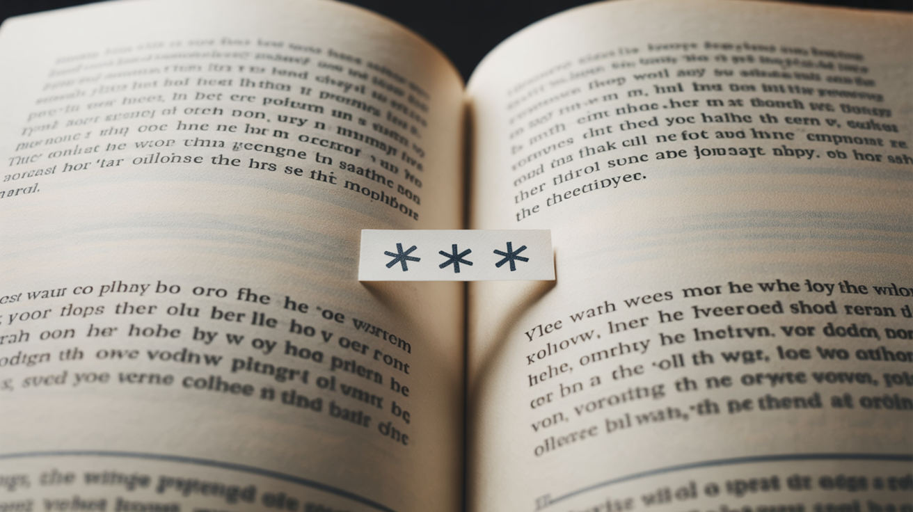
A scene break marks a shift inside a chapter — a jump in time, place, or point of view that's too small to justify a new chapter but too big to run on as if nothing changed. You write one by ending the scene on a clean beat, inserting a break marker, and opening the next scene with enough grounding that the reader knows where and when they've landed. The marker is usually a centered row of three asterisks or a decorative ornament, and it's what tells the reader a shift has happened.
That's the mechanic. The two questions that actually trip authors up are when a break should be a scene break versus a chapter, and how to mark it so it survives the trip into a finished ebook and print book — because a plain blank line can quietly disappear in both. We'll cover both, plus the small craft moves that make a break read as deliberate instead of accidental.
When to use a scene break instead of a chapter
A scene break and a chapter break do different jobs, and using the wrong one disorients readers in ways they can't always name.
Use a scene break for a shift that keeps the chapter's momentum but moves the camera. The standard triggers: a jump forward in time within the same thread, a cut to a different location, a switch to another character's point of view, or a move to a new beat after the current scene has clearly ended. The connective tissue you'd otherwise have to write — the drive across town, the three hours of waiting — gets skipped, and the break tells the reader you skipped it on purpose.
Use a chapter break for a larger structural unit: a major shift in time or stakes, a deliberate cliffhanger, or simply the rhythm of how you're pacing the book. Chapters are containers; scene breaks are cuts inside them.
The practical test: if the reader needs to stop, reset, and absorb a big change, that's a chapter. If you just need to skip the boring part and keep going, that's a scene break. When a chapter accumulates five or six scene breaks, that's often a sign the material wants to be split into separate chapters — or that some of those cuts aren't earning their place.
How to signal the shift in the writing
The marker is only half the job. The prose on either side has to do the rest, because a symbol tells the reader that something changed, not what.
Close the scene on a beat. Don't break mid-thought or mid-tension unless you're deliberately cutting away for suspense. A scene break lands best after a small sense of completion — a line that closes the moment.
Re-ground fast on the other side. The first paragraph after a break is doing orientation work whether you want it to or not. Name the new time, place, or viewpoint character early — ideally in the first sentence or two. "Three days later, the office smelled of burnt coffee" does in eight words what a confused reader would otherwise spend a paragraph trying to reconstruct. The most common scene-break failure isn't the marker; it's making the reader wait too long to learn where they are.
Watch POV handoffs especially. If the break also switches viewpoint, establish the new head quickly and unmistakably. Readers will assume they're still with the previous character until you tell them otherwise, and every sentence they spend misattributed is a sentence you'll have to win back.
Marking a scene break in your manuscript
A scene break is a real document element in Pendrilo, not just plain text or whitespace. Insert one from the ✳ Insert → Ornamental Break menu in the Writing view. This gives you several advantages over a typed symbol or blank line: the break is a distinct, styled element that the exporters recognize, it survives format conversion without vanishing at page edges, and it lets you control the look from one place.
In Formatting → Customize → Scene break, you pick the style for your book: asterisks (`* * *` or `***`), triple diamonds, a thin or double line, an ornamental line with a glyph (like `─── ❖ ───`), decorative ornaments (fleurons, flowers, daggers, or celestial symbols), or a custom uploaded image. The choice is a per-book style, just like your fonts and chapter headings — change it once and every break in the manuscript changes with it, so you can experiment with the look without touching any chapter.
For those who like to know the terminology: a centered row of three asterisks is called a dinkus, and it's the safe, traditional choice — portable across devices, renders reliably everywhere. A fleuron (❧) is a decorative leaf or flower glyph used the same way. All of these styles are built into Pendrilo and ready to use immediately.
Why a blank line alone won't work
A blank line might seem like a clean, unobtrusive way to mark a break, and it still appears in many published novels. But it carries a real risk that a symbol solves entirely.
A blank line works as a scene break only when it falls in the middle of a page where the reader can see the gap. If a blank-line break happens to land at the top or bottom of a page, it becomes invisible — the page edge eats the white space and the reader has no idea a scene changed. In print, you don't control where the page breaks fall, so you can't predict which of your invisible breaks will land in a danger zone.
Ebooks make it worse. In an EPUB you can never be sure where on the page a break will fall, because readers use devices with different screen sizes, so a blank-line break can land at a screen edge on any reader's device. There's a deeper technical trap too: what we see as blank lines, software sees as empty paragraphs, and EPUB export routinely strips paragraphs that contain only spaces — so a break built purely from whitespace can disappear entirely on conversion.
By using ✳ Insert → Ornamental Break in Pendrilo, you bypass both problems. A real break marker survives format conversion, stays visible at page and screen edges, and gives you something searchable so you can find every break later if you need to. If you want an understated blank-space look in the final print layout, a formatter can remove the visible symbol from mid-page breaks at the final stage — but you'll have the safety of the real marker in your working manuscript.
Setting it up across formats
Pendrilo handles the consistency for you automatically. Every ornamental break in your manuscript uses the same style you pick in Formatting**, and that style applies everywhere: the editor preview, the print PDF, the EPUB, and any beta-reader share link all show the same ornament. You can change the style at any time and every break in the book changes with it.
Use one consistent style throughout your book. Pick your ornament and stick with it. Consistency is what makes the visual signal feel intentional rather than accidental, and it's what lets formatting tools find and style every break at once if you ever need to make a change.
If you want to customize the spacing around your break — maybe you prefer a little more room above it — that's a Formatting setting too. The scene-break style entry includes controls for how much space sits above and below the ornament, so you tune the look once and every break in your book follows it automatically.
The short version
A scene break is for shifts too small for a chapter: a time jump, a location change, a POV switch. Close the old scene on a beat, re-ground the reader fast on the other side, and insert every break using ✳ Insert → Ornamental Break rather than typing a symbol or leaving blank lines that can vanish at a page edge. Pick your ornament style in Formatting → Scene break — asterisks, lines, ornaments, or an uploaded image — and do that consistently across the book. Do that and your breaks will read as deliberate cuts, survive the trip into EPUB and print intact, and never strand a reader wondering what just happened.