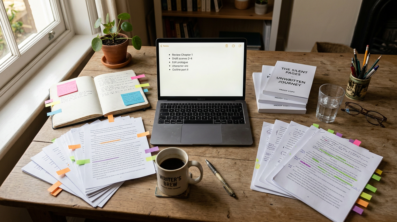
If you drafted your novel in Word or Google Docs, chances are your scene breaks are still marked with a lonely asterisk, a row of pound signs, or "# # #" left over from some old formatting template you copied years ago. It works fine in a manuscript. It looks like an amateur mistake in a finished book. Fixing this — turning those placeholder characters into real typeset scene break ornaments — is one of the fastest ways to make a self-published book look like it came from a real press, and it's also one of the easiest things to get wrong if you try to do it by hand.
Here's what a proper ornament is, why the asterisk habit sticks around, and how to convert an entire manuscript's worth of breaks without hunting through 300 pages.
What a scene break ornament actually is
In typesetting, a scene break is signaled by a centered symbol called a dinkus — traditionally three asterisks (⁂ variants), a small flourish, or a single decorative glyph, set with generous white space above and below. Its job is purely functional: tell the reader "time has passed, or the point of view has shifted" without narrating it. It should be quiet. It should never look like a leftover keyboard shortcut.
The plain asterisk or "# # #" combo that shows up in most drafts started as a plain-text convention — something visible in a monospaced manuscript file that an editor or agent could search for. It was never meant to survive into the published book. But because so many authors format their own paperback and ebook interiors by hand, the placeholder often just... stays. Readers notice. A raw "*" sitting alone on a line reads as unfinished, even if the prose around it is polished.
Asterisk vs. ornament vs. blank line
Some authors try to solve this by simply deleting the asterisk and leaving a blank line. Don't. Ebook reflow ignores blank paragraphs unpredictably across devices — a break that shows a full blank line on your laptop can vanish entirely on a Kindle Paperwhite, silently merging two scenes together. A dedicated ornament, centered and styled consistently, survives reflow because it's an actual visible character or small graphic tied to a paragraph style, not empty space depending on line breaks to hold its place.
Why the manual find-and-replace fix is riskier than it looks
The obvious DIY approach is Find & Replace: search for every "*" or "# # #" and swap in a fancier symbol like ✦ or ❧. In practice this breaks down fast.
- Asterisks used mid-sentence for emphasis or footnote markers get caught in the same sweep, and you end up hand-checking every hit anyway.
- Inconsistent spacing around old breaks (some centered, some flush left, some with extra blank lines) means the replacement doesn't land the same way twice.
- Word processors don't distinguish "this line is a scene break" from "this line happens to be a lone asterisk" — you're pattern-matching characters, not meaning.
For a 90,000-word novel with 60-plus scene breaks scattered across 30 chapters, that's an afternoon of tedious, error-prone cleanup, and it's easy to miss two or three breaks that then slip out looking wrong in the final proof.
The bulk-conversion fix: Find & Replace → Quick replacements
This is exactly the kind of repetitive, structural cleanup that is safer in an app that already knows where your chapters and scenes live. In Pendrilo, the Find & Replace panel — opened with Ctrl/Cmd + Shift + F on the editor — has a Book scope tab that reveals Quick replacements below the main search box.
One of those quick replacements is Convert scene breaks. It scans the manuscript for old-style separators (raw asterisks, pound signs, and similar placeholders) and swaps every one for a proper typeset ornament, matched to whatever formatting theme the book is using. Because Pendrilo understands your chapter structure, it applies the ornament consistently everywhere — so you don't end up with three different spacing patterns across one book. Run it once after importing an old .docx draft, and every scene break in the manuscript is fixed in the time it takes to click a button and confirm.
The tool respects your chapter and book scope choices on the Find & Replace panel, so you can convert scene breaks in the whole manuscript, one section (Front matter / Body / Back matter), or a single chapter if you prefer to take it step by step.
Worth noting: if you're importing an existing manuscript from Word or Google Docs, formatting like tables, text boxes, and inline comments won't survive the import — that's true of any writing tool doing a document conversion, not just this one. Scene break text (the asterisks and pound signs themselves) does come across fine, which is exactly what the bulk converter needs to find and fix.
How Pendrilo renders ornaments consistently
Pendrilo uses one unified glyph table for scene-break ornaments, rendering each choice at a fixed height — 0.6 inches — across the print PDF, the EPUB, and the browser preview. This consistency means you pick an ornament once, and it looks the same everywhere your book appears, with no surprises between formats. Before this standardization, the same ornament could render at different sizes depending on whether you were looking at a print proof or an ebook, which led to some ornaments looking cramped in one format and loose in another. The unified height solves that problem entirely.
Choosing an ornament that fits your genre
Not every book should use the same little flourish. A gritty thriller and a cozy romance send different signals with their typography, and the scene break ornament is a small but real part of that.
- Literary fiction and thrillers: a single centered character (•, ※, or a plain small-caps "•••") keeps things understated.
- Romance and cozy genres: a small decorative flourish or heart-adjacent glyph can feel warmer without becoming twee.
- Fantasy and epic series: a custom symbol tied to your world (a sigil, a rune-like mark) reinforces branding across a series.
- Non-fiction: keep it minimal — a simple centered rule or three dots is usually more appropriate than anything decorative.
Pendrilo's formatting themes each come with a default ornament suited to that style, and you can override it per book if you want something more specific to your series. The point isn't to pick the fanciest symbol available — it's to pick one, use it consistently, and stop making readers see the seams of your manuscript.
A quick checklist before you export
- Confirm every scene break in the manuscript uses the same ornament — spot-check a few chapters, especially any that were written or revised separately from the rest.
- Check that no stray asterisks meant for emphasis got swept into the conversion by mistake.
- Preview the ebook and paperback interior together — because the ornament now renders at a unified height across all formats, you should see the same visual weight whether you're on a 6-inch device or a printed page.
- If your book grew or shrank slightly after cleanup (removing extra blank lines around old breaks often does this), run a quick check with a free words-to-pages estimator so your paperback page count estimate stays accurate before you finalize trim size.
Cleaning up scene breaks takes maybe twenty minutes once Pendrilo handles the bulk work for you. If you're migrating a manuscript into a new writing tool anyway, it's worth doing at the same time you set up your formatting theme rather than treating it as a separate pass later. You can try the editor and formatting tools on your own manuscript to see how the conversion handles your existing breaks before committing to a full reformat.