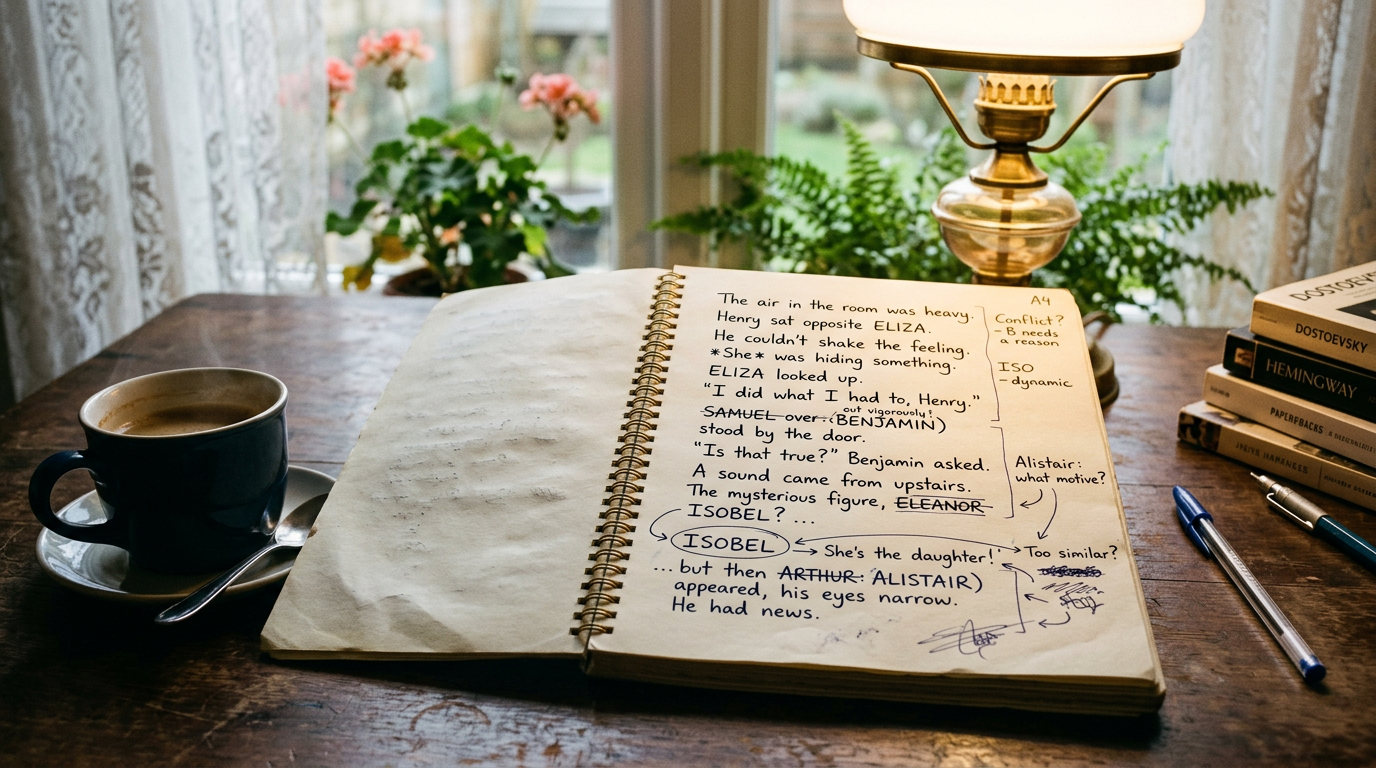
Smart typography turns ordinary keyboard punctuation into book-ready punctuation as you draft: straight quotes become curly quotes, two hyphens can become an em dash, and three periods can become an ellipsis. Set it up before your next revision pass. You will spend less time hunting symbols and reduce the chance that Chapter 2 and Chapter 28 use different conventions.
This is a small part of book production, but it is visible. Readers may not know the name for a curly apostrophe or an em dash, yet they notice when a paperback looks rough, dialogue breaks inconsistently, or punctuation changes from one chapter to the next. A clean manuscript also gives your ebook and print formatter fewer decisions to make later.
The aim is not to use the fanciest character available. It is to choose a convention that suits your book, apply it consistently, and make your writing tool do the repetitive work.
Set your smart typography rules before you start editing
Decide what each mark means in your manuscript. This matters most in fiction, where dialogue creates hundreds or thousands of opportunities for inconsistency.
A hyphen is the short mark in compounds such as well-known, time-travel, and ninety-page. It joins words.
An en dash is slightly longer: 14–18, 2008–2012, or London–Edinburgh. It usually indicates a range or connection. Many novels barely need it, but nonfiction manuscripts often do.
An em dash is longer again: “Don’t touch that—” The sentence breaks off before the speaker finishes. It can also add a sharp interruption in narration: The letter was still there—unopened, unmistakable, and addressed to him.
For US-style fiction, em dashes are usually closed up to the words on either side, with no spaces. Some publishers and regional styles prefer a spaced em dash instead. Either can be defensible. Mixing the two in the same book is the problem.
Quotes follow the same principle. Curly quotation marks point inward:
“Are you coming?” Mara asked.
Straight quotes are the plain vertical marks produced by a basic keyboard:
"Are you coming?" Mara asked.
Straight quotes are useful in code and measurements, but they are not normally the finished appearance of dialogue in a trade book. The same applies to apostrophes. A curly apostrophe in don’t, author’s, and we’ll is the expected form in a polished manuscript.
Finally, decide how you will treat ellipses. In most fiction, an ellipsis shows a thought or spoken sentence fading away:
“I thought I heard someone…”
That is different from an em dash, which signals an abrupt cut-off:
“I thought I heard—”
Those choices affect rhythm. Do not let an autocorrect setting decide the meaning for you.
Use smart typography while drafting, not during export
Authors often leave punctuation cleanup until the book is “done.” By then, it is competing with proofing, cover files, KDP metadata, page breaks, front matter, and launch tasks. That is exactly when a search-and-replace can introduce a new mistake.
Instead, turn on smart punctuation at the beginning of a project and test it with a few lines of dialogue. Type a sentence with quoted speech, an apostrophe, a contraction, two hyphens, and trailing periods. Then inspect what the editor produced.
Microsoft Word calls this setting AutoCorrect or AutoFormat. Google Docs calls it smart quotes and offers text substitutions. Other writing apps use different names, but the underlying task is the same: convert predictable typing shortcuts into the characters you want in the manuscript.
Choose inputs that are fast to type
You do not need to memorise a keyboard shortcut for every punctuation mark if your editor can convert characters as you type. Many writers use two hyphens as an input for an em dash and let the editor replace them after the next word or space. For an ellipsis, some tools convert three full stops automatically.
The important distinction is between typing shorthand and stored manuscript text. Typing -- may be convenient. Leaving double hyphens scattered through your final manuscript is not. The same applies to three separate periods when your chosen workflow uses a single ellipsis character.
If your editor does not convert punctuation reliably, use its text-replacement feature for your preferred shortcuts. Test replacements in a disposable page first. A replacement that turns every double hyphen into an em dash may be wrong in a nonfiction book containing negative numbers, technical notation, or copied source material.
Do not “fix” intentional punctuation blindly
Automation is useful because most prose follows predictable patterns. It is not a substitute for judgment. Preserve literal text where the character itself matters: code samples, quoted social posts, archival documents, a character’s typewritten letter, or dialogue intentionally styled as text messages.
Likewise, an author may deliberately use three periods rather than an ellipsis character in a particular design treatment. There is no universal law that every book must use one Unicode glyph. What matters is that the choice survives export cleanly and is applied on purpose.
Keep a short style note with the project if you work with editors, proofreaders, or beta readers. One line is enough: “Use closed em dashes; use curly quotes; use ellipses for trailing dialogue.” It saves repeated questions and prevents well-meaning collaborators from changing a correct passage to match their personal habit.
Watch the punctuation cases automation gets wrong
Smart typography is good at ordinary dialogue. The exceptions deserve a targeted check, especially after pasting material from notes apps, email, web research, or an older manuscript.
Leading apostrophes
The classic trouble spots are dropped letters and abbreviated decades: ’tis, ’round, rock ’n’ roll, and the ’80s. The apostrophe should look like a closing single quotation mark, curving toward the letters that follow.
Some programs see a mark at the beginning of a word and produce an opening single quote instead. It is a subtle visual difference, but it is easy to spot once you know where to look. Search for terms beginning with an apostrophe during your final proof.
Nested dialogue and possessives
Curly quotes need direction. In a line such as “Did he really say ‘never again’?” the outer double quotes and inner single quotes should all face correctly. Pasted text can scramble them, particularly if it has passed through a plain-text editor.
Also inspect contractions and possessives after a bulk conversion. A good search list includes it’s, its, you’re, your, they’re, and their. This is partly a copyediting check, not just a typography check, but it catches punctuation errors that look polished at a glance.
Ellipses at the end of dialogue
Style guides differ on whether terminal punctuation follows an ellipsis in certain contexts. Your genre, editor, and chosen style guide should settle that question. Do not alternate between “I don’t know…” and “I don’t know….” merely because different writing apps make different assumptions.
For most novelists, the practical rule is simple: use the form consistently, then read the surrounding dialogue aloud. If the character trails away, an ellipsis fits. If another speaker cuts them off, an em dash is usually the clearer signal.
Run a focused punctuation audit before KDP export
Before you create an EPUB or print PDF, do one pass for punctuation only. This is faster than trying to notice every character while you are also judging plot, grammar, and page design.
Use your editor’s search tool to find likely leftovers. Check each result in context rather than replacing everything in one click.
- Search for double hyphens: --.
- Search for three periods: ....
- Search for straight double quotes: ".
- Search for straight single quotes where your software can distinguish them from curly apostrophes.
- Search for a space on either side of an em dash if your house style uses closed em dashes.
Be careful with the results. Double hyphens may be intentional in an email address, a quoted document, or a separator in notes. Three periods may appear in a table of contents placeholder or an excerpted source. The audit is a review queue, not permission for indiscriminate replacement.
Then inspect the exported file, not just the manuscript view. EPUB is reflowable, so it changes with font size and device settings. A punctuation mark that looked fine on a wide laptop screen may wrap awkwardly on a small Kindle screen. Print PDF has different concerns: justified text, embedded fonts, and line endings can make uneven punctuation spacing more obvious.
If you are estimating a print page count before setting up your interior, Pendrilo’s free tools include a words-to-pages estimator. It will not proof punctuation, but it can help you plan trim size and spine width before you order a proof.
How Pendrilo keeps manuscript punctuation consistent
Pendrilo’s focused editor has smart typography for auto-curly quotes, em dashes, and ellipses. It works while you write, so the manuscript does not accumulate basic keyboard punctuation that needs a separate conversion pass later. Smart typography is a per-book setting, and you can turn it off for an individual chapter when that chapter contains text that should remain literal.
That chapter-level control is useful for an appendix with code, a reproduced letter, or a formatting experiment. For ordinary prose, leave the setting on and spend your attention on the exceptions: the interrupted line of dialogue, the apostrophe in ’cause, or the deliberate stylistic break.
If you want to test the editor with an existing project, start a seven-day trial. New trial accounts include one book and up to 3,000 cumulative words, with no card required and no automatic conversion to a paid plan. A dialogue-heavy scene is enough to see whether the punctuation behaviour matches the way you write.
When the manuscript is ready, Pendrilo can export standard EPUB 3 and print-ready PDF files. Correct punctuation will not make a weak layout strong, but it removes one avoidable source of roughness from both formats. Get the marks right as you draft, audit the edge cases before export, and your final formatting pass can stay focused on the things that genuinely need human attention.